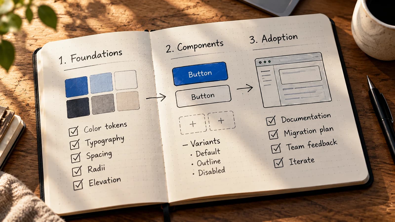
Consider a hypothetical team with three versions of the same Save button. One has a focus indicator, one submits a form unexpectedly, and one has a different disabled state. A shared component library exists, but the next feature still copies a button from an older screen.
The problem is not necessarily that the library needs more components. It might be harder to adopt than the code teams already have. A useful design system must answer three questions for its consumers: What should I use? What behavior can I rely on? What happens when it changes?
A design system includes design decisions, usable code or patterns, documentation, and a way to maintain them together. A design file or React package can be part of that system, but neither establishes adoption on its own.
This guide walks through an illustrative Save action pilot. It is a method to try, not a claim that a particular company ran it or achieved a measured improvement.
Start with repeated decisions, not a component wishlist
Before designing a new Button API, examine a few real interfaces. For each candidate, record the action, existing markup, visual differences, interaction behavior, and owning team.
| Existing use | User intent | What to standardize | What may stay local |
|---|---|---|---|
| Save changes | Perform an action | Button semantics, focus, loading/disabled rules | The save request and its error message |
| Go to settings | Navigate to a page | Link semantics and shared visual treatment | Destination and routing |
| Delete account | Perform a destructive action | Action semantics and confirmation guidance | The product-specific deletion flow |
This distinction matters: navigation is normally a link, not a button with a click handler that changes the URL. Likewise, a library should not hide a product-specific confirmation flow inside every button.
For a small pilot, ask two product teams to identify where they currently solve the same interaction differently. That is a proposed research step, not evidence that two teams have agreed. If the only example exists in one screen and has unique behavior, keeping it local may be the better choice.
A practical candidate should have an identifiable consumer, repeat across contexts, and offer a clear improvement over existing implementations. The GOV.UK Design System contribution criteria require evidence that proposed components are useful and distinct, then assess usability, consistency, and versatility before publication. You can adapt that discipline without copying GOV.UK's exact process.
Specify one component as a contract
A Button contract should say what consumers can assume, not only what the component looks like.
For the first pilot, keep its supported surface deliberately narrow:
- Purpose: trigger an action. Use an anchor for navigation.
- Markup: native
<button>, with an explicittype. - Supported states: default, keyboard focus, and native
disabled. - Content: a visible, descriptive action label; do not start with icon-only buttons.
- Ownership: the system owns shared appearance and interaction expectations; each product owns its action and outcomes.
- Out of scope: async loading, destructive confirmations, split buttons, and menu triggers until there are real requirements and tests.
Why specify type? Inside a form, an HTML button without a type can submit it. Why use a real button? It already supports expected keyboard activation and disabled behavior. See the MDN button element reference and WAI's button interaction pattern.
Here is a standalone browser example, deliberately using HTML and CSS rather than introducing a React package before the contract is understood. Save it as button-pilot.html and open it in a browser:
<!doctype html>
<html lang="en">
<meta charset="utf-8">
<meta name="viewport" content="width=device-width, initial-scale=1">
<title>Button pilot</title>
<style>
  :root {
    --action-bg: #204568;
    --action-text: #ffffff;
    --action-focus: #b83b0a;
    --space-sm: 0.5rem;
    --radius-sm: 0.375rem;
  }

  .ds-button {
    font: inherit;
    min-height: 2.75rem;
    padding: var(--space-sm) 1rem;
    border: 1px solid transparent;
    border-radius: var(--radius-sm);
    background: var(--action-bg);
    color: var(--action-text);
    cursor: pointer;
  }

  .ds-button:focus-visible {
    outline: 3px solid var(--action-focus);
    outline-offset: 3px;
  }

  .ds-button:disabled {
    cursor: not-allowed;
    opacity: 0.65;
  }
</style>
<button class="ds-button" id="save" type="button">Save changes</button>
<button class="ds-button" type="button" disabled>Unavailable</button>
<p id="status" role="status">Ready</p>
<script>
  document.querySelector('#save').addEventListener('click', () => {
    document.querySelector('#status').textContent = 'Saved';
  });
</script>
This is not a production-ready library component. It demonstrates the smallest useful contract: shared styling, a native action control, an explicit type, an observable result, and a keyboard-visible focus state. In a production form you would also need a real persistence flow, error handling, pending-state behavior, and product-specific messaging.
The CSS variables illustrate two layers: --action-bg, --action-text, and --action-focus describe component-facing semantic roles; --space-sm and --radius-sm describe reusable foundation values. A different theme can replace the color values without rewriting every button selector. That does not mean CSS variables magically synchronize design files and application code. A maintained source, an explicit export or transformation step, and release ownership are still required. See MDN's CSS custom-property guide.
For teams exchanging tokens across tools, the Design Tokens Community Group format, version 2025.10, defines a vendor-neutral structure with $value and $type. The CSS above is not a DTCG token file; it is one possible output or runtime representation. The stable community-group specification is also not a W3C Recommendation.
What a component story or demo must prove
A screenshot of the default button proves very little. Before declaring this pilot stable, verify at least:
- Tab focuses the enabled button and shows a visible indicator.
- Enter and Space activate it; the status updates as expected.
- The disabled example is not keyboard focusable and cannot activate.
- Putting the action button inside a form does not submit the form inadvertently.
- Labels remain understandable, focus is not obscured, and the control works at narrow widths and increased zoom.
- Colors and focus outlines are checked against actual adjacent surfaces in each supported theme.
WCAG 2.2 Focus Visible requires a visible keyboard-focus mode. A successful automated audit alone cannot establish usability across assistive technologies. Tools such as the Storybook accessibility addon can catch some detectable problems, but manual keyboard and assistive-technology checks still belong in the acceptance process.
Make adoption a smaller change than divergence
A usable component can still fail if replacing old implementations requires a risky rewrite.
In the pilot, make the first migration deliberately small:
- Choose two existing screens with the same action semantics. Capture their current keyboard behavior and visual states.
- Replace only the shared button treatment, keeping each screen's action handler, data flow, and message logic where they are.
- Record exceptions. If a screen cannot use the shared contract, write down why before adding a new variant.
- Review with consumers. Ask the implementing engineers what was confusing and check the result with design and accessibility reviewers.
- Publish a short migration note, including the supported import or CSS class, known limitations, and where to report a problem.
This is also a sensible place to distinguish component status:
| Status | Consumer expectation |
|---|---|
| Proposed | Discuss intent and evidence; do not depend on it yet |
| Pilot | Try in named contexts; API and guidance may change |
| Stable | Documented behavior, owner, tests, and a change policy |
| Deprecated | A replacement and migration path are provided |
Do not call something stable just because its Figma variant and React prop names match. A consumer needs predictable keyboard behavior, guidance for error states, support, and a release path.
Decide how changes enter the system
A design system needs an answer to "I need another variant." Without one, teams either fork the component or the core library accumulates dozens of props.
Use a lightweight proposal with five fields:
- Problem and contexts: Which user action is failing, and in which screens?
- Current alternatives: What do teams use today, and why is it insufficient?
- Evidence: Reproduction, screenshots, accessibility findings, or user research with stated limits.
- Proposed contract change: New behavior, token, or variant; interaction and accessibility implications.
- Migration and owner: Who reviews it, who updates documentation, and who handles downstream breakage?
A request can result in reuse an existing pattern, extend a shared component, or keep a product-specific implementation. Rejecting a variant is not a governance failure if the team explains the decision and provides an alternative.
For stable consumers, state whether a change is compatible, deprecated, or breaking. Changing focus handling, removing a prop, or altering submit behavior deserves more scrutiny than adjusting an internal CSS declaration. Publish examples and migration instructions with the same change that modifies the component. If you distribute a versioned package, document which consumers need to upgrade; a release tag by itself does not migrate existing applications.
Measure whether people can use it
Counting components in a library is an inventory metric, not adoption evidence. A pilot needs a small set of questions whose answers can actually guide the next decision.
| Question | Evidence to collect | What it cannot prove |
|---|---|---|
| Did teams use the shared component? | Approved usage in the selected screens, with exceptions noted | That all implementations are correct |
| Was migration practical? | Time spent, blockers, required local overrides | A universal productivity improvement |
| Is the contract reliable? | Keyboard and visual test results, defects and regressions | Full accessibility for every user |
| Can teams get support? | Issues opened, response ownership, resolved documentation gaps | That the system is widely adopted |
Record a baseline before the pilot, even if it is only a reviewed list of existing buttons and known problems. Revisit the same screens after migration. If people still copy old markup, ask why: maybe the API is too restrictive, documentation is difficult to find, or the system does not cover a legitimate case. Do not turn an unmeasured claim such as "we ship twice as fast" into a success story.
A good first release may contain just one dependable component and a few tokens. Expand when a second use case teaches you something the original contract did not cover. The point is not to centralize every UI decision; it is to make shared decisions trustworthy and inexpensive to reuse.